
6 Tips to Choose Your Platform Color Scheme
Have you ever visited a website or an app and instantly felt drawn to its color scheme?
Choosing the right colors for your platform can significantly impact your professional brand’s overall look and feel.
But with so many options to choose from, how do you know which color scheme is right for you?
In this article, you’ll learn to select an ideal color scheme for your digital solution that resonates with your brand identity and engages your visitors so you’ll know which colors best suit your activities.
What Is a Color Scheme?
A color scheme is the process of purposely selecting and strategically incorporating colors into a website or an app to convey a brand personality.
The color palette is usually composed of diverse matching tones, which can enhance the overall aesthetics and potentially improve the user experience.
Why Colors Are Important for a Website and App?
Colors play a significant role in eliciting emotions, influencing user behavior, and communicating brand messaging.
A suitable color scheme can evoke trust, excitement, tranquility, or even urgency.
The chosen shades can also help guide users through the platform by indicating clickable elements, highlighting important information, or creating a visual hierarchy.
Poor color choices, on the other hand, can make a website or application appear unprofessional, confusing, or unappealing, leading to a negative user experience and potentially driving visitors away.
Ideally, to select suitable hues, factors such as the following should be considered:
- target audience
- brand image
- industry trends
- cultural associations
- accessibility guidelines
By considering all these elements in your color choices, you can make your content more legible and potentially enhance your chances of driving your users to take the desired action and convert.
5 Tips to Select a Suitable Color Palette for Your Website and App
Here are some easy tips to pick up a suitable color palette for your digital solution:
Define Your Colors Utilization
The first step in choosing the right color for your needs is choosing the primary colors that match your brand identity.
These colors might be the most often displayed on your website or app, as they can be found on most pages and screens.
Then, there are the shades to apply to typographies, which are the ones for the text and different titles.
It might be wise to use colors that are in notable contrast with the background one, as this makes readability much easier for the final user.
Finally, certain hues should be determined to accentuate certain elements, such as a call to action or a widget.
As soon as these colors have been determined, you should have something like this in mind:
- primary color: design
- secondary color: design
- tertiary color: text
- quaternary color: title
- quinary color: accentuate an element
- senary color: accentuate an element
This color preset will help you with the following steps to refine your choice.
Understand Your Chosen Hues Signification
While correctly assigning colors to specific purposes can significantly impact your final color choice, it’s also essential to understand how colors interact with each other and how they can be used to trigger strong reactions and emotions from your final users.

Here are some popular hues with their related emotion so you can pre-select the one fitting your activities:
- Blue: peace, sympathetic
- Green: growth, nature
- Purple: glamorous, noble
- Red: passion, love
- Orange: enthusiasm, creativity
- Pink: tenderness, youth
- Black: elegance, mystery
- White: goodness, innocence
- Yellow: hope, joy
With these expressive reactions in mind, narrowing down your color palette with fitting emotional hues is easier.
Use a Color Wheel
A color wheel is a fundamental tool in color theory, showing the relationships between colors and helping to create harmonious color schemes.
When using a color wheel to determine the different hues to use with a platform, it is essential to consider the various color harmonies and combinations that will create a visually appealing and cohesive design.
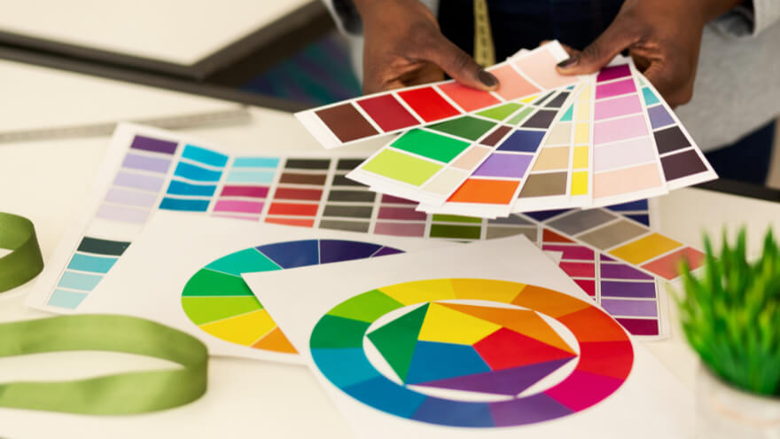
A color wheel usually showcases:
- Analogous colors are the ones next to each other on the wheel and can create a harmonious and soothing effect.
- Complementary colors are opposite each other on the wheel and create a dynamic and high-contrast look.
- Triadic colors are evenly spaced around the wheel and can create a balanced and vibrant design.
That’s why using the color wheel as a guide makes it easier to choose suitable hues that work well together while conveying the desired mood or message for your website or app.
It might also be used to compare the different tones with your first color presets and check their compatibility with each other.
Receive actionable tips to enhance your business processes and exclusive offers right into your inbox!
Keep in Mind Accessibility
Considering accessibility when determining hues is also crucial to ensure that all users, including those with visual impairments, can easily navigate and engage with your platform.
That’s why choosing colors that have enough contrast and are easy to read can make the content more accessible to a broader audience for a more inclusive and successful digital presence.
Experiment with Multiple Shade Variations
Experimenting with different sets of shade variations is essential to determine which one is the most effective and willing to convert while maintaining your brand identity.
Testing different color palettes also helps identify any potential issues with their contrast, readability, or accessibility, ensuring that the final overall design is visually appealing and functional, from your point of view, as for the one from your final users.

And that’s it for this article!
Keep in mind that choosing a suitable color scheme for your digital platform is crucial to creating a visually appealing and cohesive design.
By following these tips, you can ensure that your website or app looks great and effectively communicates your brand message to your audience.
But remember that shades can evoke emotions and impact user experience, too, so choose wisely and make your solution stand out from the rest!