5 Tips to Select Suitable Fonts for your Platform
Have you ever visited a website or an app and been immediately turned off by its font choice?
The fonts used on a digital platform are crucial in its overall appeal and readability.
So, choosing the right typefaces can significantly affect how final users perceive your platform.
In this article, you’ll learn to select ideal fonts that match your brand image and how you can organize them to maintain coherence within all your platform’s pages and screens.
Don’t want to read?
Here’s the audio retranscription:
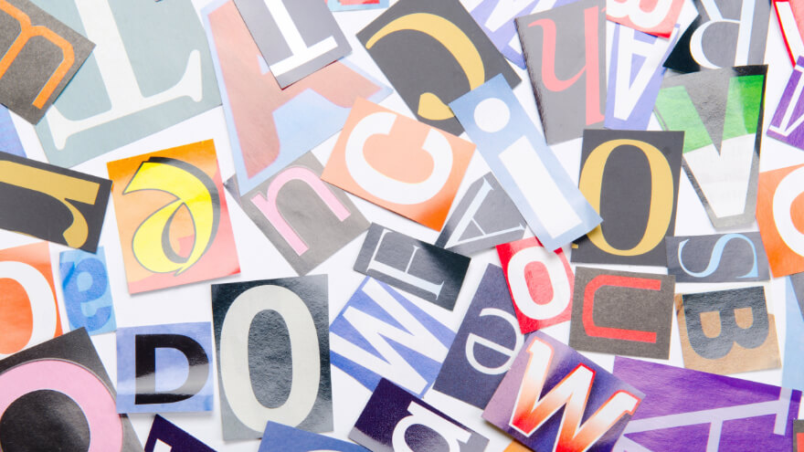
What is a Font?
A font is a visual representation of text that embodies a specific set of characters, letters, numbers, and symbols with a consistent design aesthetic.
A suitable font is essential for enhancing written content’s overall aesthetics and readability, whether in print or digital platforms.
Each typography has its unique characteristics, including factors such as:
- size
- weight
- spacing (space, line height)
- style (serif, sans serif)
All of which contribute to the readability and visual appeal of written text.
How Many Fonts Should I Use?
Using only 2-3 fonts in your digital platform design is essential because it helps maintain visual consistency and coherence throughout the project.
Having too many different fonts on your pages and screens can create a cluttered and chaotic design, making it difficult for the audience to focus on the main message.
By limiting the number of typography used to only 2 or 3 ones, you can create a more polished and professional look that enhances the overall aesthetic appeal.
Additionally, using a small number of typefaces also helps to establish a clear hierarchy and organization within the platform design, making it easier for users to navigate and understand the content.
5 Tips to Select Suitable Fonts for Your Digital Platform
Know Your Industry Trends
Knowing your industry trends is crucial when choosing fonts for your professional company.
Different industries have different aesthetics and target audiences, so selecting typefaces that align with those characteristics is essential.
For example, a tech startup may opt for modern and sleek typography to convey innovation and the latest technologies, while a luxury brand may choose elegant and sophisticated fonts to reflect its high-end image.
By staying informed about your current industry trends, you can ensure that your font choices are visually appealing and resonate with your target market.
Furthermore, this attention to detail can also help your company stand out and establish a strong and cohesive brand identity within your industry.
Consider Font Readability
Font readability is essential when conveying information effectively to the reader.

Easy-to-read ones can significantly affect how quickly and accurately information is processed, so choosing a clear and legible font can help ensure the reader can easily comprehend the text without straining their eyes.
It is also essential to consider the context in which the font will be used, as some fonts may be more appropriate for different types of content.
Choose a Good Font Pairing
Pairing your initial font with other matching ones also helps to keep coherence throughout the project.
Usually, selecting fonts with similar styles, such as sans-serif fonts with other sans-serif typefaces and serif fonts with other serif typefaces, can greatly enhance the design of your pages and screens.
Furthermore, paying attention to font sizes and weights can also contribute to a harmonious and balanced overall look for your digital platform.
Receive actionable tips to enhance your business processes and exclusive offers right into your inbox!
Determine Their Hierarchy
Establishing a font hierarchy is crucial to ensure a visually balanced overall design.
By separating and assigning specific fonts for titles and text, you can establish a first kind of hierarchy among your different typography.
It’s then important to stick with this hierarchy throughout all your pages and screens to maintain consistency and coherence.
When you ensure it’s indeed the case throughout your content, you get a well-organized hierarchy that helps guide the reader’s eye through it and creates a more polished and professional look.
Experiment Your Fonts
Frequently experimenting with different fonts can help you choose the ones that best fit your brand, as it’s essential to determine which ones work best for your target audience.
By trying them out with different styles and on multiple screen sizes, you can gather some precious analytics data to find the ones that resonate the most with your audience while still aligning with your brand identity.

And that’s it for this article!
Choosing the right fonts for your website and app may seem like a small detail, but it can make a huge impact on how your final users receive your content.
With so many options available, it’s essential to consider your brand image, targeted audience preferences, and overall design aesthetic when making your selections.
Remember, selecting the right typefaces can help convey your message effectively and make your digital platform stand out.
So, choose wisely and watch your solution come to life with the perfect typography!