Make your website fits more devices with enhanced
Responsive Functionalities
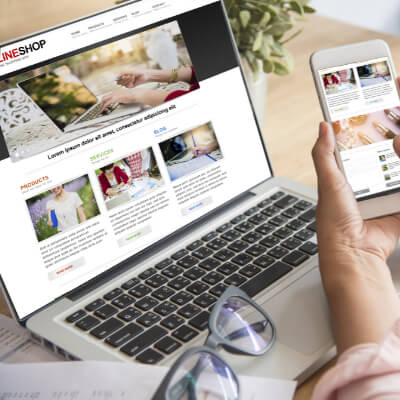
We can make your website more adaptive to multiple devices and screen resolutions so that its content always displays as expected
Enhanced User Experience
Our team helps professional companies enhance their website’s responsive functionalities to keep visitors engaged and satisfied.
We implement design changes to create a seamless browsing experience, no matter their devices, that encourages users to explore your content and interact with your brand.


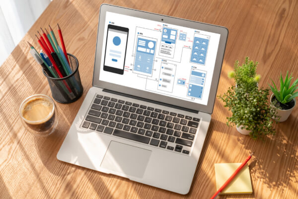
Seamless Content Display Across Multiple Devices
Gone are the days when websites were only viewed on desktop computers.
With the rise of smartphones, tablets, and laptops, professional companies need websites that seamlessly adapt to different screen sizes.
That’s why our developers and UX designers can help your brand by ensuring that your content displays flawlessly on any device, providing a user-friendly experience for your customers no matter how they access your site.

Multiple Screen Resolutions Optimized Display
We believe that all professional websites should be accessible to everyone, regardless of their abilities, especially when providing services or selling products.
That’s why our team can improve your website’s accessibility features to ensure that all visitors can easily navigate and interact with your site.

Why should we optimize your website’s responsive features
Does this sound familiar?
Your website doesn’t display properly on some smartphones, tablets or computers
Your website has some display issues with some screen resolutions
Explore our website responsive functionalities Packages
Choose an offer below
Website Responsive Functionalities
$ Variable
/per site
We’ll make your website more adaptive to multiple devices and screens