How to Generate Photorealistic Images with AI

Nowadays, generating images for business purposes remains a veritable challenge that professionals must face.
Between all the necessary generations to achieve the right output, the ones that present any noticeable flaws, the ones that still match the intent, the ones that lack consistency, and the ones that come out with a different style than what you were expecting, getting the perfect image isn’t as easy as it seems.
Among all those challenges, one of the most challenging and in-demand types of images across industries is realistic AI-generated images, which must also feature nuanced lighting, authentic textures, and precise details.
In fact, for many leaders and creative professionals, consistently achieving true photorealism remains a challenging yet elusive goal.
It’s not enough to simply describe a scene; it must also evoke a sense of place.
It must also evoke a sense of place.
The art of generating images indistinguishable from real-world photos hinges on mastering the intricacies of prompt engineering.
In this article, we will equip you with actionable techniques, data-backed insights, and expert tips to enhance your AI image generation capabilities, ensuring your outputs are not only visually appealing but also genuinely realistic.
What Is Photorealism in Image Generation?
In image generation, photorealism refers to the creation of images that are so lifelike they are virtually indistinguishable from photographs taken with a real camera.
The photorealism style is characterized by an exacting attention to detail in elements such as accurate lighting, realistic textures, nuanced shadows, and precise proportions.
Unlike cartoonish, 3D render, anime, digital art, abstract, or painterly styles, photorealism aims to replicate the visual fidelity of the physical world, capturing its inherent imperfections and stochastic nature.
What are the Most Suitable Models or Solutions for Photorealistic Generations?
To date, the most suitable models for Photorealistic AI generations are:
- Nano Banana Pro
- GPT Image 1.5
- Flux 2
- Z-Image
- Qwen Image / Qwen Image Edit
- Stable Diffusion 3 / XL / 1.5
- MidJourney
- Leonardo AI

10 Tips to Achieve Photorealistic Results with AI
Here are some tips you can implement right now to improve your AI generated image photorealism:
Forget Everything you Know about Image Quality Qualifiers
Crafting prompts for photorealism goes far beyond simply adding “4K” or “hyperrealistic” to your input. In fact, these overused qualifiers often trigger the model’s “aesthetic bias,” leading to overly polished, CGI-like / digital art results rather than genuine optical authenticity.
The real secret lies in specificity, technical detail, and a strategic use of negative prompts when the feature is supported by your selected model, to avoid this digital art effect in the output.
For those already used to generating images, forget everything you know about generic quality qualifiers like “4K“, “8K“, “ultrarealistic“, “hyper-realistic“, or “masterpiece“.
These terms often guide the AI towards an idealized, often artificial, aesthetic that prioritizes digital perfection over the raw, imperfect beauty of a real-world photo.
Instead, focus on emulating the actual conditions and equipment of photography.
Here’s a short list of Image quality qualifiers to forget in the most recent image generation models, as they just bloat your prompts:
- 4K, 8k, 12k
- Ultrarealistic, Hyper-realistic, realistic
- Masterpiece, best quality, award-winning
Emulate Camera and Lens Photo Details
To achieve a real-world photo look, you must prompt the AI as if you were instructing a photographer.
It usually involves specifying camera models, lens types, and photographic settings that influence the final image’s characteristics.
That’s why you should use a photo lens and describe the camera details.
Instead of using generic quality terms, you should specify the equipment in your prompt.
For example:
- “Shot with a Canon EOS R5 camera with an 85mm photo lens”
- “Captured on a Fujifilm GFX100S with a 50mm lens, f/1.2”
This guides the AI to render images with the unique optical properties associated with that gear, including depth of field, field of view, and potential distortions.
Popular Cameras to Use in Your AI Prompts
Some of the most popular cameras to use in your prompts are:
|
Camera |
Effect |
|---|---|
|
Sony A7R IV / A7R V |
It triggers the model to render extreme fine detail (pores, fabric weave) and vibrant, modern color |
|
Canon EOS R5 |
It triggers warmer skin tones and softer, more pleasing contrast than the Sony. Great for pictures with a real feeling touch |
|
Nikon Z9 |
Often produces a punchy, high-contrast look that feels very professional and editorial |
|
Leica M6 |
The ultimate qualifier for “street photography.” It signals to the AI to make the image look candid, artistic, and slightly less “polished/fake”. |
|
Hasselblad 500C/M |
Used for medium-format film looks. It creates a distinct depth-of-field (square bokeh) and incredibly rich textures |
|
Kodak Portra 400 / Fujifilm Superia |
(Note: These are films, but often used in the “Camera” slot). Adds nostalgic warmth and specific color grading (teals and oranges) without needing complex lighting prompts. |
|
ARRI Alexa 65 / ARRI Alexa LF |
The industry standard for Hollywood movies. Using these cameras guides the AI to use “dynamic range”, keeping details in both the brightest highlights and darkest shadows. |
|
IMAX 70mm |
Signals massive scale and epic composition. Great for landscapes or sci-fi environments. |
|
Panavision Millennium DXL2 |
A “magic word” for modern, sleek sci-fi aesthetics with cool anamorphic lens flares. |
Popular Photo Lens to Use in Your AI Prompts
Some of the most interesting photo lens details to use in your prompts are:
- 35mm (storytelling, environment)
- 85mm (portrait style)
- 50mm (reality, documentary)
- 200mm (fashion style)
- 300mm (landscape style/wildlife style/sports style)
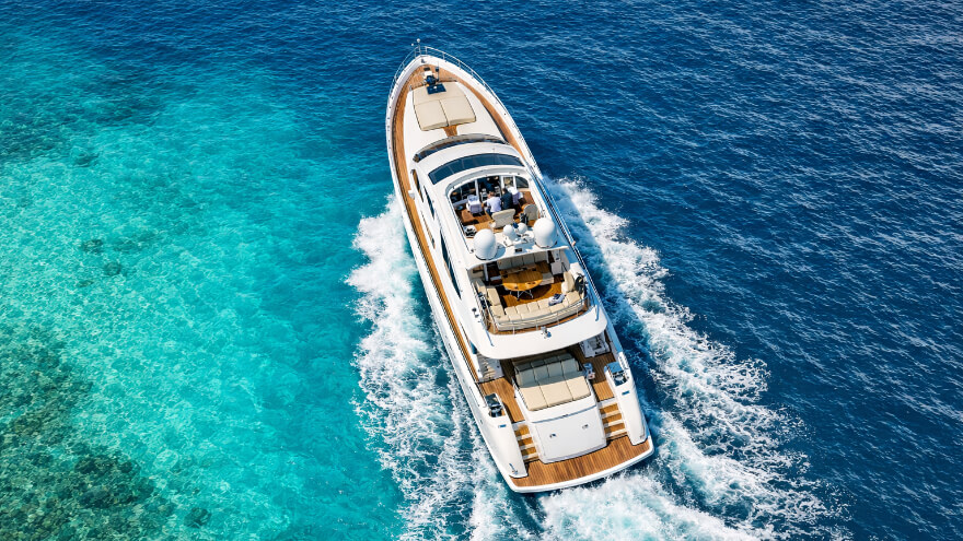
Photorealistic aerial photograph of a luxury motor yacht cruising at the edge of the Caribbean Sea, just beyond a Caribbean landing bay marina, captured from a true top-down (90°) bird’s-eye view, as if taken by a flying drone directly above the vessel.
Shot on a Canon DSLR, using a 300mm telephoto lens, f/11, ISO 200, daylight white balance.
The yacht is centered in frame, fully visible from bow to stern, with a clean, symmetrical, high-end composition. Surrounding the yacht, the Caribbean coastal water displays layered tropical color gradients—clear turquoise and light aqua near shallow areas, transitioning into richer cyan and deep blue tones farther out.
The water clarity varies naturally, with crystal-clear shallows revealing subtle seabed coloration and depth gradients, and darker, less transparent blues indicating deeper water beyond the marina exit. The yacht’s wake gently cuts through these color layers, producing soft white foam that contrasts sharply against the tropical blues.
The scene reflects a Caribbean environment: bright sun, clean atmosphere, vivid yet natural color saturation typical of islands such as St. Barthélemy, the Bahamas, or the Lesser Antilles, without visible land dominating the frame. Any marina influence remains subtle and peripheral, implied by water tone transitions rather than prominent structures.
The image exhibits maximum sharpness and deep depth of field, with no motion blur, no haze, and no atmospheric distortion. Yacht materials—polished white hull, teak decking, glass, and metal—are rendered with ultra-high realism and fine detail.
Lighting is natural Caribbean midday sunlight, producing soft, accurate shadows and premium, neutral color grading suitable for luxury yacht advertising or editorial photography.
Ultra-realistic professional drone photography style.
Aspect ratio: 16:9 (landscape)
Resolution: high
No text, no logos, no watermark, no stylization, no exaggerated colors
Specify Aperture and Shutter Speed
To get the best results from recent image generation models like Nano Banana Pro, GPT Image 1.5, Flux 2, and Z-Image, you might also consider using advanced physics awareness descriptions in your prompts to calculate light paths.
By inputting precise aperture and shutter speed values in your prompt, you provide a universal “physics constraint”, overriding the default artificial sharpness filters of your selected AI image generation model and forcing the model to render optically accurate artifacts.
Using Aperture Values
The aperture allows, in simple terms, to control the depth of field (DoF) by telling the AI model exactly how to command the depth.
The value of the aperture (f-stop) is usually between f/1.2 and f/16, where the highest values are more suitable for a generated image with an expected focus on the subject, while the lowest values are more suitable for deep-focused images with a larger depth of field.
Here are the common aperture values you can use in your prompts:
|
Subject Isolation |
Deep Focus |
|---|---|
|
f/1.4 |
f/5.6 |
|
f/2 |
f/8 |
|
f/2.8 |
f/11 |
|
f/4 |
f/16 |
An important thing to know about the aperture value interpretation by AI image generation models is that:
- For high aperture values, the models are programmed to keep the subject sharp while rendering the foreground and background as soft, out-of-focus blur (also named “bokeh” effect). It’s actually essential for portraits to prevent the “cut-out sticker” look. It also means that even if your model supports negative prompting, and you use terms such as blurred background to prevent the bokeh effect, you’ll still generate images with a blurred background just because you used high aperture values in your prompts.
- For low aperture values, their utilization instructs the models to suppress the background blurred effect (bokeh). It ensures that details in the corners and on the horizon remain crisp and sharp, which is critical for landscapes, architecture, and complex street scenes. As for the highest aperture values, using a low aperture value in your prompts
Additionally to those aperture values, you might also consider using the following keywords into your prompts for additional accuracy:
|
Low Aperture (Subject Isolation) |
High Aperture (Deep Focus) |
|---|---|
|
shallow depth of field |
deep depth of field |
|
creamy bokeh |
edge-to-edge sharpness |
|
separation from background |
hyper-focal distance |
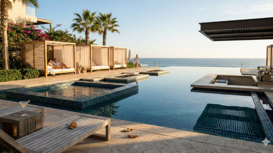
A stunning, architectural photograph of a sleek, modern swimming pool set within the landscaped grounds of an exclusive luxury hotel and spa resort. The scene is one of tranquil, high-end relaxation.
Composition & Perspective: Shot with a 24mm wide-angle lens to capture the expansive scene. The composition follows the rule of thirds, with the infinity edge of the pool and the distant ocean horizon aligning with the upper third line. A series of private, minimalist cabanas line the left third.
Key Details & Architecture: The pool is a large, multi-level infinity pool with a built-in jacuzzi, lined with dark blue and emerald mosaic tiles that create a deep, inviting color. The surrounding architecture is a blend of natural stone, teak wood, and frameless glass. There are sunken lounge areas with fire pits and a cantilevered pool bar.
Landscape & Texture: The area is surrounded by lush, manicured landscaping with mature palm trees, native grasses, and flowering bougainvillea. Textures are rich: rough-hewn travertine pavers, smooth water reflecting the sky, soft linen drapes on the cabanas, and the grain of weathered wood furniture.
Lighting & Mood: The photograph is taken during late afternoon “golden hour,” casting long, soft shadows and bathing the entire scene in a warm, inviting glow. The atmosphere is peaceful and exclusive.
Technical Settings: Aperture set to f/5.6 for a deep depth of field. Shutter speed 1/250th to freeze the gentle movement of water in a decorative fountain. A fine, high-quality film grain is present.
Imperfection & Life: A few dried leaves on the stone deck and a forgotten cocktail glass on a side table add a touch of imperfection. A couple is relaxing in one of the cabanas, and a spa attendant is walking in the distance, adding scale and a sense of life.
Negative Prompt details: (crowded:1.5), (public pool:1.5), (children:1.3), water slides, plastic furniture, outdated architecture, harsh midday sun, flat lighting, cloudy water, litter, industrial elements, urban background, oversaturated colors.
Using Shutter Speed Values
The shutter speed values dictate how the image generation model will render the “time” in the frame.
It is particularly handy for generated image involving a specific shot at a certain time in a sequence involving moving subjects.
Without this value, AI models might hallucinate awkward textures on moving objects.
That’s why specifying speed tells the model whether to render a moment frozen in time or the passage of time.
The values of the shutter speed are commonly between 1/2s and 1/1000s, where the lowest values are more likely to freeze the frame, and the highest values to add a motion blur effect, which can, for some generated images, be the expected result to achieve.
|
Image Freeze Effect |
Image Motion Blur Effect |
|---|---|
|
1/1000s |
1/125s |
|
1/500s |
1/60s |
|
1/250s |
1/48s |
|
– |
1/15s |
|
– |
1/8s |
|
– |
1/4s |
|
– |
1/2s |
prompt
So the shutter speed details might be handy when the image you intend to produce has some kinds of dynamic moves to capture, such as for example photos of a dynamic subject in a dancing scene or even the capture of a dynamic scene of a road with traffic lights and cars.
An important thing to know about the shutter speed value interpretation by AI image generation models is that:
- For high shutter speed values, providing such values overrides the model’s tendency to freeze everything. It forces the generation of directional blur (motion lines) and kinetic noise, which adds realism and energy to shots involving cars, crowds, or flowing water.
- For low shutter speed values, utilizing such values signals the model to render “hard” edges on moving subjects (like water, hair, or vehicles). It prevents the AI from smoothing out textures that should be sharp, ensuring distinct droplets or individual strands of hair.
Additionally to those shutter speed values, you might also consider using the following keywords into your prompts for additional accuracy:
|
Fast Shutter (Freeze Effect) |
Slow Shutter (Motion Effect) |
|---|---|
|
frozen action |
motion blur |
|
zero motion blur |
long exposure |
|
crisp detail |
dragging light |
|
high-speed capture |
kinetic energy |
Examples of integration in your prompts:
- Subject Isolation: “shot on Canon R6, f/1.4 aperture, shallow depth of field, creamy bokeh”
- Deep Focus: “shot on Phase One XF, f/11 aperture, deep depth of field, edge-to-edge sharpness.”
- Freeze Frame: “shot on Nikon Z9, 1/1000s shutter speed, frozen action, high-speed capture”
- Motion Blur: “shot on Sony a7S III, 1/8s shutter speed, long exposure, motion blur, dragging light”
Incorporate Film Grain and Noise
Real photographs, especially those taken in challenging conditions or with older cameras, have grain.
So to achieve photorealism in AI image generation, it’s normal to consider it as a must-have addition in your prompting.
In fact, the noise grain has shifted from being a byproduct of the diffusion process to a critical aesthetic and functional feature. It is no longer just “static” to be removed.
It is the key ingredient that separates “AI-slop” (smooth, plastic-looking outputs) from professional, photorealistic, or artistically authentic results.
Here are some handy keywords to achieve a more photorealistic look with your AI generations:
|
Traditional Photography |
Documentary Photography |
Textures |
|---|---|---|
|
35mm film grain |
High ISO |
Raw photo |
|
16mm film grain |
ISO 1600 |
Unpolished |
|
8mm film grain |
ISO 3200 |
Unedited |
|
Cine-film |
Dashcam footage |
– |
|
– |
Phone camera |
– |
|
– |
CCD Sensor |
– |
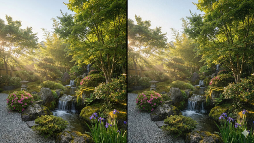
A professional photographic side-by-side comparison image, presented in a strict 16:9 landscape aspect ratio. The frame is split vertically down the precise center into two equal halves. Both halves depict an identical Asian-inspired landscape garden scene at the exact same moment in time, with identical framing, lighting, and perspective.
The Scene & Subject: A tranquil, meticulously designed garden blending Japanese, South Korean, and Chinese aesthetics. Lush greenery, varied colorful flowers, organic stone placements, and a small cascading waterfall flowing over natural rock formations are central. The composition is balanced and serene.
Left Half (Reference): This half is a pristine, ultra-clean digital photograph. It exhibits maximum clarity, perfectly smooth tonal transitions, and zero visible film grain or noise, emphasizing pure digital sharpness.
Right Half (Variable): This half is identically composed but features a subtle, realistic analog film grain applied evenly throughout the entire tonal range—highlights, midtones, and deep shadows—providing an organic photographic texture absent on the left.
Lighting & Atmosphere: The scene is captured in bright early morning summer light. Soft golden sunlight filters through the foliage, creating gentle highlights, delicate shadows, and a calm atmosphere. Subtle, natural mist rises near the waterfall.
Technical Settings: Shot on a full-frame DSLR. Aperture set to f/8 for a deep depth of field, rendering the entire garden sharp. Shutter speed 1/100s, naturally freezing the crisp water flow. ISO 200. Daylight white balance.
Negative prompt details: text, labels, arrows, logos, watermarks, graphic overlays, exaggerated stylization, painterly effects, artificial blur, chromatic aberration, dramatic color grading, vignetting, HDR look.
Utilizing Rule of Thirds and Symmetry (or breaking them)
Rule of Thirds in Use
If you’re already generating images with AI that involve the presence of a human subject, then you might have noticed the usual model biases regarding the position of the subject, and especially the centered position bias, where most human subjects are most likely to be at the exact center of the composition.
We’ll not dive too much into the theory here, but what matters for your generations is that the rule of thirds is about dividing your image into a 3×3 grid (like a tic-tac-toe board).
What you might be interested to know is that the human eye naturally drifts to the intersection points of these lines, not the center.
So you might want to add empty areas that give more room to breathe or look into your generations, which helps your images feel more candid, dynamic, and narrative.
Here are some prompting techniques you can use to get the most out of the rules of thirds:
- Use grid language: “Subject positioned on the right vertical third line” or “Sun setting at the bottom-left intersection point”.
- Define the subject’s exact position in the composition: “Profile shot of a woman on the left side of the frame, looking into the negative space on the right.”
- Keep the aspect ratio in mind: the center bias is strongest in square images (1:1 ratio such as 1024*1024px or 512*512px images). By simply prompting for a wide aspect ratio (16:9 or 21:9), you naturally encourage the AI to spread elements out across the horizontal plane.
- Describe the flow of action (instead of static placement): “A sprinter bursting from the bottom-left corner toward the top-right”. This prompt hack forces the AI model to use the diagonal thirds, creating a high-energy dynamic composition that a centered image can never achieve.
Symmetry / Asymmetry in Use
While the Rule of Thirds is about where you place the subject, the symmetry, or its opposite, asymmetry, is about how you distribute the “visual weight” of the image.
To get professional results, you need to understand the difference between the precision of symmetry and the organic tension of asymmetry.
Intentional Symmetry
Symmetry creates a sense of stability, engineering perfection. In AI, there is “lazy centering” (the defaut behavior of most AI models), and then there is Intentional symmetry. The latter implies that the subject was designed to be viewed head-on.
For example:
- “Head-on view of a luxury sedan, studio lighting, perfectly symmetrical grill and headlight alignment, 50mm lens.”
- “Inside a subway tunnel under construction, centered perspective, vanishing point in the middle, identical concrete ribs repeating into the distance.”
- “Flat lay of construction tools arranged by size, perfectly balanced on a concrete surface, organized knolling style.”
Asymmetry
Asymmetry is not just “unbalanced”.
It is the art of balancing elements that aren’t the same size, so asymmetrical images feel more candid and narrative.
They show scale and interaction rather than just product isolation.
For example:
- “A construction worker in a high-vis vest in the bottom left foreground, looking up at a massive, towering crane dominated the right side of the sky.”
- “Over-the-shoulder shot of an architect holding a blurry blueprint in the left foreground, sharp focus on the asymmetrical steel framework rising in the background right.”
- “Interior car shot, driver positioned on the right, looking out the left window at a blurred city motion, visual weight heavy on the driver side fading to light on the street side.”

Photorealistic interior design comparison image, ultra-high realism, captured in landscape format (16:9 aspect ratio), split vertically into two equal halves for direct visual comparison, in the style of an Architectural Digest editorial interior photograph. Left Side — Perfect Symmetry: A modern, semi-luxury lounge room interior designed with impeccable architectural symmetry. The L-shaped sofa is perfectly centered and mirrored with flawless alignment and identical cushion spacing. A large, wall-mounted flat-screen TV is positioned precisely on the central axis of the main wall. A refined, minimalist coffee table is placed exactly at the visual center of the room. Floor-to-ceiling windows are evenly spaced and proportioned, framing a manicured private garden with lush greenery. The composition feels calm, balanced, and architecturally exact, emphasizing order, proportion, and spatial harmony. Right Side — Intentional Asymmetry: The exact same lounge room, same camera position, same lighting conditions, same materials and furniture — but styled with deliberate asymmetry. The L-shaped sofa is subtly offset, with cushions arranged in an organic, uneven manner. The wall-mounted TV is slightly off-center. The coffee table is positioned asymmetrically, breaking the central axis. Window framing and decor placement introduce visual imbalance while remaining cohesive and refined, creating a curated, lived-in sophistication. Environment & Design Language: Contemporary modern interior with semi-luxury residential styling. Architectural Digest aesthetic: timeless elegance, restrained luxury, clean lines, thoughtful negative space, and editorial composition. Neutral palette of warm beige, soft gray, muted taupe, and natural wood accents. Large windows open onto a private garden with soft natural daylight filtering into the space. Lighting & Mood: Natural daylight as the primary light source, diffused and soft. Subtle ambient interior lighting for depth and warmth. Balanced exposure with gentle highlights and realistic shadows, emphasizing textures and materials. Photography & Rendering Details: High-end interior photography style, Architectural Digest magazine quality. Shot on a full-frame DSLR or medium-format camera aesthetic. 35mm lens, straight-on eye-level perspective. Accurate global illumination, realistic reflections, true-to-life materials. Ultra-sharp detail, clean tonal transitions, high dynamic range. Constraints: No people present. No text, captions, labels, or graphic overlays. No distortion or wide-angle exaggeration. Clean, elegant, editorial realism.
Balancing Foreground and Background Elements
Balancing foreground and background elements can also drastically improve your generated images’ realism, especially as they can be used to make your compositions way more natural.
Usually, the image generation models tends to outputs results where their rendered images features lighting, sharpness, and texture completely uniform across the entire frame.
It provides a kind of “unnatural” output where the subject looks like a high-resolution sticker slapped onto a flat wallpaper.
The human eye immediately spots this as fake because cameras don’t see the world that way.
That’s why to achieve true photorealism in your images, you must prompt for depth.
Using Obstacles
You must first add elements in your prompts to put obstacles between the lens and the subject to prove the camera is physically present.
Here are some example of prompts that include obstacles for additional realism:
- “Low angle shot of an excavator, shooting through the diamond mesh of a blurry chain-link fence in the foreground.” (The fence proves we are outside the danger zone, adding narrative realism).
- “Wide shot of a rally car cornering, obscured by kicking up mud and blurry tall grass in the bottom foreground.”
- “POV shot from the stern, out-of-focus teak wood decking and a blurry champagne glass, framing the ocean horizon beyond.”
- “Low angle shot of a superyacht, shooting past the blurry, rusted texture of a dock cleat and thick mooring rope in the immediate foreground.”
Using Close Textures
Realism lives in the textures close to the lens. AI struggles with ground texture at a distance, but excels at it up close. So you might also be interested by using one in your prompting.
Here are some example of prompts that include close textures for additional realism:
- “A site manager walking toward a building. Ultra-detailed, sharp focus on rough gravel and puddles reflecting the sky, leading the eye to the softer focus subject.”
- “A racing sailboat cutting through waves. Ultra-detailed, sharp focus on splashing white sea foam and water droplets hitting the lens, creating a chaotic entry point to the sharp subject.”
Using Atmospheric Perspective
In reality, air is not perfectly clear.
It has dust, moisture, and density to create the kind of atmospheric perspective, where things further away look lighter, bluer, and less contrasty.
Atmospheric perspective is simply the visual result of looking through a thick layer of these particles.
The farther away an object is, the more air and particles you must look through to see it.
So, to look like a photo, the background must interact with the environment in the same way, not just sit there.
Here are some examples to add some background interactions with your elements:
- “A luxury yacht anchored in a bay, distant mountainous coastline, faded by heavy sea mist and blue atmospheric haze, low contrast compared to the stark white yacht.”
- “Yacht profile at sunset, the sun touching the horizon, creating a soft, glowing orange gradient that melts the water line into the sky, avoiding a hard, sharp horizon.”
- “A crane operator in the cabin, a massive city skyline, faded by atmospheric haze and distance, low contrast compared to the sharp subject.”
- “Car parked in a tunnel, receding tunnel lights turning into a soft, glowing blur (bokeh), indicating deep distance.”
Directing Perspective and Angle
In AI image generation, the camera perspective and angle create the narrative.
When you don’t specify an angle, AI models default to “Eye-Level.”
It’s the most neutral, passive way to view a subject.
So to take control and pass over the initial eye-level behavior, you must think like a film director in your approach.
And, as a film director in being, you should care about the placement of the camera as it dictates how the viewer feels about the subject.
Here are the most used perspectives and angles to use in your prompts:
|
Perspective & Angle |
Effect |
Keywords |
|---|---|---|
|
Eye-Level |
The default perspective of most image generation models. It is the most neutral, passive way to view a subject. |
Eye-level shot, neutral perspective, standard view, human perspective, on the same plane |
|
Low angle |
It makes the subject look larger, taller, and more dominant. It creates a sense of power or intimidation. |
Low angle, Worm’s-eye view, looking up, frog perspective, ground-level shot |
|
High angle |
It creates clarity of layout, but can also make the subject look smaller, weaker, or solitary. |
High angle, elevated view, drone shot, crane shot, looking down |
|
Bird’s-eye view |
It flattens the image into a 2D diagram. It creates graphic design appeal rather than immersion. |
Top-down, flat lay, satellite view, 90-degree angle |
|
Frontal / Head-on |
Confrontational and engaging. The subject is usually looking directly at the viewer. This often creates symmetry. |
Front view, head-on, mugshot style, 1-point perspective |
|
Three-quarter view (3/4) |
It is the standard for product design and portraiture. It reveals the depth and volume of the object (you can see the front and the side). |
3/4 angle, three-quarter turn, isometric view (for rigid 3D styles) |
|
Profile (Right or Left) |
Detached and observational. The viewer is watching the subject do something, rather than interacting with them. |
Side profile, side view, silhouette, left view, right view |
|
First-Person point of view (POV) |
Maximum immersion. The viewer becomes the protagonist. |
POV, first-person perspective, GoPro footage, body cam |
|
The dutch angle |
It creates unease, tension, disorientation, or high-energy chaos. It tells the viewer that “something is wrong” or “action is happening fast.” |
Dutch angle, tilted frame, canted angle, dynamic tilt |
Choosing Appropriate Color Palettes
Another way to get more realistic results is by specifying a color palette.
A set of colors that can be used in your prompts to provide directives on the tones associated with the scene.
In the latest image generation models, the color palette is more about setting the color ambiance than setting rough colors, as it could be with old generation models.
By defining a color palette, you can also prevent the “plastic look”, commonly visible on characters.
Detailing Textures and Imperfections
Describing textures and imperfections can greatly enhance your prompt ability to generate more realistic results, depending on the model you are using.
To achieve optimal results, especially with recent image generation models, your prompts should provide some details about the material surface and how the ambient lighting interacts with it.
By default, those models tend to favor smooth and perfect textures, providing your composition with the popular, unwanted AI plastic look.
It’s especially visible when prompting for characters, but also for some kinds of materials or surfaces, and that’s the main reason your generations look like digital art, 3D render, or even CGI.
So to achieve more realistic results, you must incorporate the principle of imperfections into your prompts.
- For surfaces, you might notice that they are never perfectly flat but have features, ridges, bumps, and holes.
- For a character’s skin, you might notice that even the beauty celebrities never have perfect and uniform skin, but instead have some natural “imperfections”, such as scars, uneven skin tone, etc. So you might look for such terms in your prompts to favor more natural and realistic characters.
- For materials, you might notice that some of them, such as fabric, aren’t flat but instead provide a sort of texture with relief, with multiple threads twisting over and under each other, for example. What you want to do is specify its specific composition so it changes its topography.
Here are some examples of keywords you could use in your prompt to add more realistic textures into your generated images:
|
Materials |
Surfaces |
Characters |
|---|---|---|
|
Coarse weave, pilling, stray threads, lint, heavy gauge, uneven stitching, Slubby linen texture, frayed hems, pulled threads, loose fibers, moth-eaten holes, faded crease lines, visible warp and weft, uneven dye absorption, worn velvet nap, stiff denim folds, static cling, dust accumulation on fuzz, stretched elasticity, translucent sheer layering |
Brushed metal, cast iron texture, porous stone, grainy wood, pitted concrete, Splintered edges, peeling varnish (crazing), sun-bleached grain, water ring stains, resinous knots, rough-sawn marks, end-grain porosity, dry rot texture, polished but scratched veneer, galvanic corrosion, iridescent oxidation, flaking rust, anisotropic reflections (brushed metal), efflorescence (salt deposits) on brick, exposed aggregate in concrete, mossy crevices, eroded sandstone, oil-slick residue, chipped enamel, dust layers on glass, condensation trails, smudge marks |
Pores, micro-details, vellus hair, peach fuzz, fine facial hair, soft downy hair on cheeks/forehead, matte skin with localized shine, skin texture variation, delicate capillary visibility, natural skin oil sheen, goosebumps, uneven skin tone, hyperpigmentation, freckles, sun spots, age spots, neck hair follicles, visible arm hair, subtle redness on cheeks/nose |
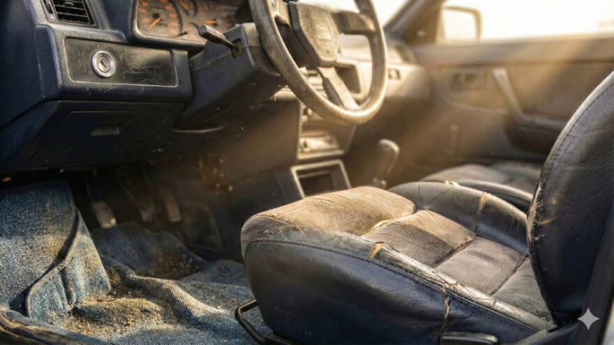
POV macro shot from the interior of a vintage 1980s rally car, bathed in harsh low-angle afternoon sun (raking light). The image is a raw photograph captured on a Fujifilm GFX 100S Medium Format camera paired with a Fujinon GF 120mm f/4 Macro lens. The shot is taken at aperture f/8.0 to ensure deep textural clarity across the uneven surfaces, with an ISO of 400 to introduce a slight organic grain and a shutter speed of 1/60s for a handheld aesthetic. The focus is tight on the side bolster of the bucket seat, revealing cracked patina and desaturated stress marks where the leather has worn down to the suede. The dashboard plastic features scuffed polymer edges and micro-scratches on plastic around the ignition. Floating within the sunbeams are volumetric specks of lint and dust, while the floor mat texture shows stiff denim folds and coarse weave dirt accumulation.
Use Negative Prompts (When Supported by Your Image Generation Model)
The last tip that could enhance your prompts to achieve realism in your generation is the use of negative prompts.
It’s simply about mentioning what you don’t want to see in your image composition.
However, the feature will not be available for all image generation models.
For some of them, it is simply unnecessary, and you can achieve great results without specifying any negative keywords in your prompting, especially given their specialties and focus on training.
Here are some that could be handy depending of your expectations:
|
Artificial fix |
Unnatural beauty fix |
Clarity & Flatness fix |
Quality fix |
|---|---|---|---|
|
illustration, painting, drawing, sketch, anime, cartoon, graphic, vector art, cel shaded, 3d render, cgi, octane render, unreal engine, video game asset, digital art, clay, plastic, mannequin, doll, toy, fake, artificial |
airbrushed, smooth skin, retouching, makeup, perfect skin, symmetry, filters, beauty mode, glossy, magazine finish, porcelain skin, wax |
depth of field, tilt-shift, motion blur, out of focus, vignette, chromatic aberration, lens flare, bloom, overexposed, underexposed, high contrast, silhouette, chiaroscuro, harsh lighting, volumetric lighting, fog, haze, mist, distortion, fish-eye |
low resolution, jpeg artifacts, compression, pixelated, blurry, noise, grain, watermark, text, logo, signature, bad anatomy, deformed, disfigured, mutated, extra limbs, cut off, cropping, bad framing |
And here are some examples that show how you can use them as negative prompt:
- for surface and material: “blurry, bokeh, blurry background, sunny rays, glares, shadows, depth of field, vignette, high contrast, lens flare, motion blur, 3d render, cgi, illustration, painting, cartoon, drawing, sketch, watermark, text, logo”
- for characters: “illustration, painting, cartoon, 3d render, cgi, airbrushed, smooth skin, plastic skin, doll, mannequin, retouching, makeup, perfect symmetry, bad anatomy, blurry, low resolution”

In summary, achieving true photorealism in AI image generation isn’t about magic words, but about understanding how AI ‘sees’ the world and then guiding it away from its digital biases.
By focusing on technical photographic details, embracing imperfections, and strategically using negative prompts, you can remove the default artificial look of your AI outputs to create images that are much closer to real-world photos.
Integrating those tips into your prompting can significantly help you transform your AI image generation from mere artificial results into optically authentic visuals that drive real business value.
Be sure to keep experimenting, refining, and pushing the boundaries of what’s possible, while remaining responsible for your image use.
And if you want to discover more insights and advanced AI solutions, don’t forget to follow us on LinkedIn.