5 Reasons To Have a Responsive Website
With the rise of portable devices and varying screen sizes, it’s essential for professional companies to design websites that adequately react to the final user’s display resolution, size, or even orientation.
But did you know a website’s design can significantly impact its success?
In this article, you’ll discover the importance of having a website with a responsible design and how it can benefit you and your online objectives.
What is a Responsive Website
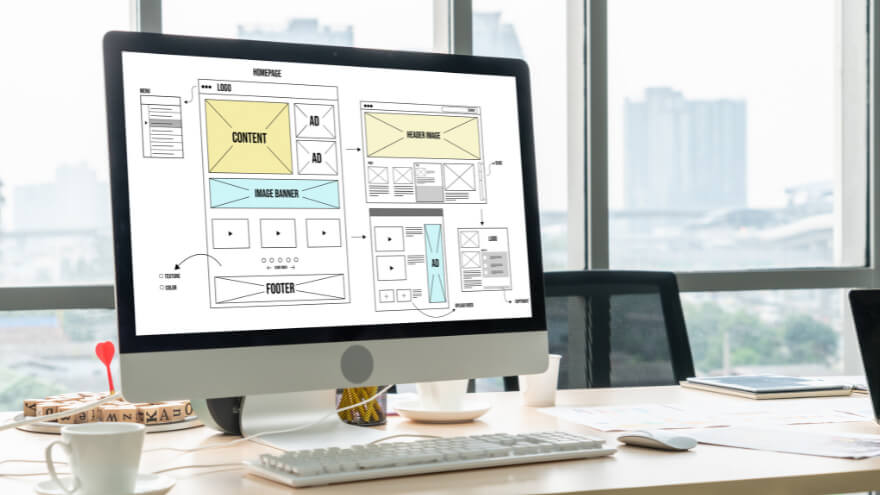
A responsive website is a site that can adapt to different screen resolutions or devices to ensure optimal browsing experiences for its users.
Usually, featuring a responsive design allows websites to adjust their layout, images seamlessly, and other elements’ behaviors to suit specific screen resolutions and devices being used.
5 Essential Reasons to Get a Website with a Responsive Design
Here are some good reasons to care about a website’s responsive design:
Improved Usability on Specified Devices
Firstly, having a website for its professional activities with a responsive design guarantees that its navigation remains intuitive and user-friendly, regardless of the device.
Nowadays, it is especially important as users are more inclined to remain engaged with your website and explore its content when they can effortlessly locate what they seek.

Undoubtedly, a website with a responsive design is instrumental in ensuring a user-friendly browsing experience across a range of devices:
- For instance, a dedicated mobile version of your website, designed specifically for smartphones, can offer a more streamlined and optimized experience. It can include features such as larger touch targets, simplified menus, and mobile-friendly layouts, making it easier for users to navigate and interact with your content on their smartphones.
- Similarly, a tablet-optimized design can take advantage of tablets’ larger screen sizes, providing users with a more immersive and visually appealing experience. It can include features such as sidebars, image variations, split-screen layouts, and interactive elements that are optimized for the tablet form factor.
- Lastly, a dedicated desktop version of your website design will typically have a wider layout, allowing for more information to be displayed simultaneously. It can include features such as a mega menu, search bar, full-sized images, other interactive elements, and content blocks, which will be appropriately spaced to provide a comfortable viewing experience.
By implementing responsive features for dedicated devices, you can create a truly personalized and device-specific experience for your users, leading to increased engagement, improved usability, and higher conversion rates.
Flowing Navigation on Targeted Screen Resolutions and Orientation
A responsive website dynamically adapts its layout and elements to seamlessly fit the used device’s screen size, resolution, and orientation.
This user-centric approach goes beyond ensuring effortless navigation.
It enhances a website’s usability by accommodating different devices’ specific screen resolutions and possible screen orientations.
So whether a website visitor is browsing the site in portrait or landscape mode, with a low screen definition or a high definition, all visual elements properly react to the actual user display.
Mobile-First Design Possibilities
The proliferation of smartphones and tablets has revolutionized how people access the internet.
That’s why acknowledging that mobile devices account for a substantial portion of web traffic is imperative.
By adopting a responsive design, you can cater to this burgeoning mobile audience and ensure that your website is accessible and engaging on any screen size.
However, even though a site can adequately function at its best with standard responsive features, making it mobile-first is yet something different to consider nowadays.
In fact, a website with a mobile-first design means that its design elements are thought to be appropriately displayed on mobile before any other platforms.
By embracing this approach alongside standard responsive features, professional websites are more likely to maximize user satisfaction and contribute to their search engine optimization efforts.
Receive actionable tips to enhance your business processes and exclusive offers right into your inbox!
Better User Retention
Another reason to care about a website’s responsive abilities is that they undoubtedly benefit user retention by reducing its bounce rate, which refers to the percentage of visitors who leave the site after viewing just one page.
A professional website without any responsive features is more likely to display visual elements with unexpected behaviors, often making the browsing experience more challenging and sometimes even impossible for its visitors.
Visitors are then more likely to leave the website directly without interacting with your content or exploring other pages.
On the other hand, a well-crafted responsive design greets the users with a layout and content optimized for their specific device, making it easier for them to navigate and interact with the site, leading to increased time spent on it.
Enhanced Overall User Experience
Finally, all these previous reasons provide the website’s visitors with an overall enhanced user experience.
As a responsive website effortlessly adapts its display to their device’s screen, they are more likely to return in the future, fostering a sense of loyalty and trust.
This enhanced user experience can then positively impact key metrics such as potential sales, conversion rates, and customer retention.

And that’s it for this article!
You now perfectly understand the reasons for getting a website with a responsive design.
So, whether you implement these dynamic features to enhance your professional website’s overall user experience, achieve business objectives, or both, it will likely greatly impact your site’s results.